Technically, I think you could argue that most of my art is adapted in some way. For icons I frequently used references, for labels I had a process of taking elements from stuff like game boxes or promotional material, limiting the colours, scaling down, then cleaning them up, and even the sketches in my Other Art section I took into Photoshop to clean up as well. With that said, this page is for HyperFlash art created by other users that I feel I've changed enough to include here (I'd recommend visiting either the icon or label page first if you haven't yet).
First up are some of the icons I've adapted. Original (unaltered) versions are on the left, while my adapted versions are on the right. The people who originally created these icons go by Fwow13, and Mumphy on the Planet Virtual Boy forums, and you can find more of their work (as well as mine, under my PVB name TheRedMenace) here.
Continuing with icons, there's also this Cheep Cheep which I adapted, then decided to convert the NES sprite over to black and white to see how it compared. I think my adapted version of Fwow's icon is still probably best (the one in the middle). Most of the icons here were actually adapted from long icons, so I figured I'd show you an example of one of the "full" original versions as well, since my adapted version for the one shown is also a long icon. On the same line as the Cheep Cheeps, you can see the parts I ripped from the long icon to use in my adaptation (which is below Fwow13's unaltered long icon).


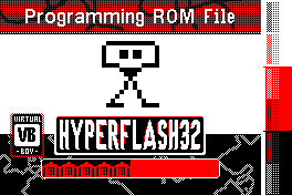
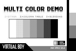
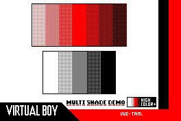
Next, I've also adapted a few labels too. First you up can see the original programming label by Mumphy, and my mockups for what it could look like on the red cart (unfortunately it isn't practical to use red in the flashing screen since it takes a lot longer to "load" than the black and white e-ink). After that, you'll see my adaptations of Team VUEngine's Multi Colour Demo, which expand the dither selection, and adapt for the red screen respectively.
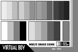
If you'd like to see the shade demos on cart, you can click here, or as a bonus thing, you can see the special thanks label (which includes me in it) by clicking here. They'll appear a bit blurrier than the photos really are, but if you zoom in and back out by clicking with the little cursor, it should show you something closer to the original quality. Alternatively, you can try downloading them, which will presumably retain the original clarity.
Email: noahcbs@gmail.com or noahcbsbusiness@gmail.com